You might have noticed something different on your screen this week. YouTube has rolled out a substantial visual update and new features to its video player across mobile, web, and TV devices—and it’s all about making your viewing experience “cleaner and more immersive.”
While a redesign can be jarring at first, the changes bring some slick new features that you’ll definitely want to know about.
Here is a breakdown of the key updates in the new YouTube video player:
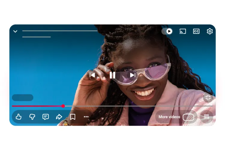
1. A Cleaner, More Immersive Design
The most obvious change is the new visual style. YouTube has opted for a look that aims to obscure less of the content you’re watching.
- Updated Controls and Icons: The buttons and icons have been refreshed with a softer, somewhat translucent design. Many controls are now grouped into “pills” or rounded boxes, especially on mobile and TV, making the interface feel less cluttered when it pops up.
- Content is King: The goal is to make the player controls less distracting, ensuring the video itself takes center stage.
2. Fun, Dynamic “Like” Animations
Engagement just got a little more expressive. On select content, the Like button will now feature a custom, dynamic visual treatment.
- Content-Based Cues: For example, liking a music video might trigger an animated musical note, while liking a sports video could show a visual cue related to the game. It’s a small addition, but a fun way to acknowledge a video you enjoy.
3. Smoother “Seek” and Mobile Transitions
Two quality-of-life improvements make navigating videos and the app itself feel much more fluid.
- Less Intrusive Seeking: The popular double-tap to skip/seek feature has been updated. YouTube says this is now “more modern and less intrusive” to your viewing experience, displaying the skipped duration briefly on the screen.
- Seamless Mobile Transitions: For mobile users, moving between tabs (Home, Shorts, Subscriptions) will now feature improved motion design, making the switch feel quicker and more fluid.
4. Structured Comment Threading
Following conversations is about to get a whole lot easier. The comments section is getting an overhaul with a new structured threading system.
- Easier-to-Follow Replies: This change introduces a clearer visual hierarchy for replies, similar to what you might see on platforms like Reddit. It’s designed to provide a more focused reading experience, so you can track who is responding to whom without getting lost in a long chain.
5. Simplified Video Saving
The process of saving a video to your Watch Later list or adding it to a playlist has been streamlined. The refreshed design is now more visual and is intended to simplify the process.
The new video player and its features are rolling out globally now. While any major change to a platform we use every day can take some getting used to, these updates signal YouTube’s ongoing commitment to a more modern, expressive, and less-cluttered viewing experience.
What do you think of the new look? Are you a fan of the custom like animations or the new comment threading? Let us know in the comments!


